Kingston University · MSc · 2024
Forge
All five test participants completed all five core tasks in a challenge-based self-improvement app.
5/5
participants completed every core task
4
hypotheses written before any screen
5
core tasks tested with think-aloud
00 / Summary
- Role
- UX designer
- When
- April 2024
- Platform
- iOS app
- Method
- Lean UX
- Colour
- #3843FF
- Problem
- People give up on self-improvement goals when they're alone with them.
- What I did
- Designed a challenge-based app with Lean UX hypotheses, community features and personal badges.
- Result
- Every participant finished every core task, and the badges motivated more than expected.
01Problem
Motivation isn’t the problem. Isolation is.
People rarely fail at self-improvement for lack of willpower. They fail because the tools leave them alone with their goals, inside apps that promise transformation and deliver complexity.
Research showed people stick to goals more often when they’re part of a supportive community. Yet most personal-development apps treat users as isolated individuals. No platform combined social support, gamification and simplicity in a way that felt human.
02The bet
I turned beliefs into testable hypotheses.
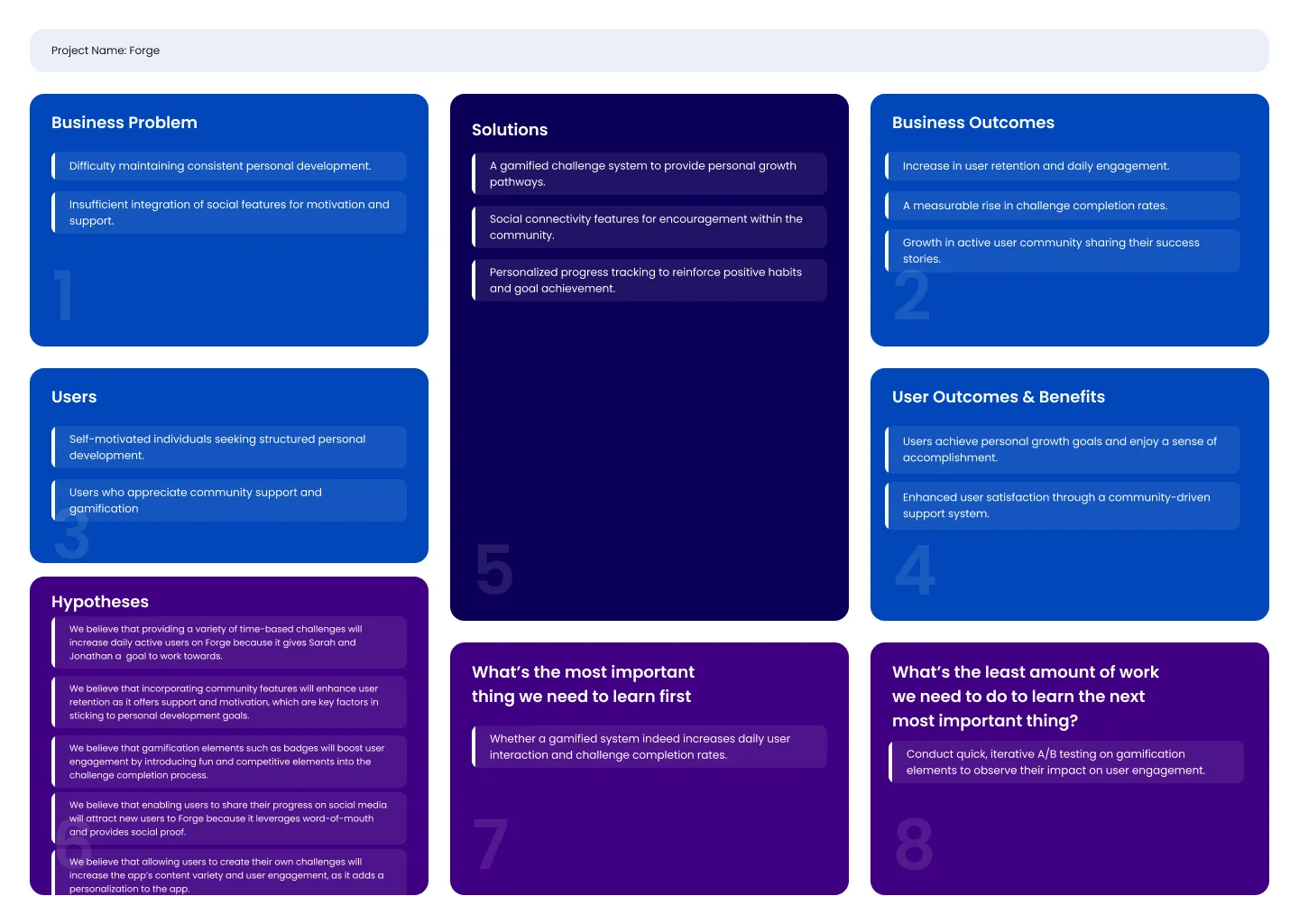
Before designing screens, I wrote each assumption as a hypothesis with a way to know if it was true. The Lean UX canvas kept the business problem, the users and the riskiest assumption on one page.
- Varied, time-based challenges would bring people back daily.
- Community features would keep people motivated through peer support.
- Badges would make finishing a challenge feel rewarding.
- Letting people create challenges would give them ownership.
03Process
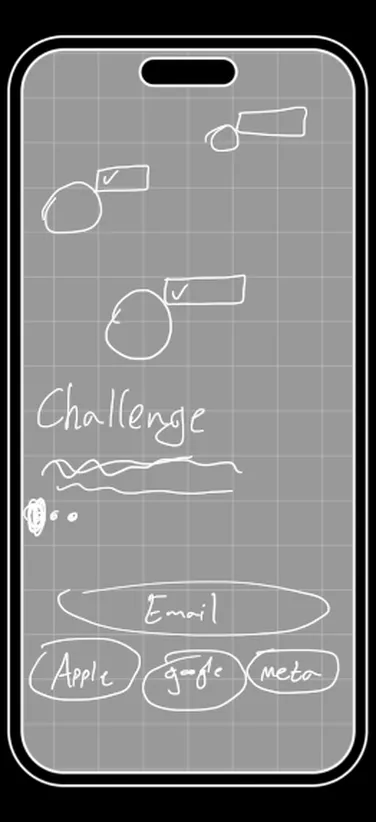
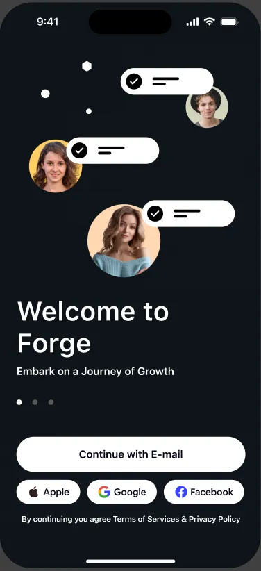
Paper first, then pixels.
Research pointed the same way again and again. People need to see progress every day, variety keeps routines from going stale, and community support was rated extremely important by most participants. They also juggled several apps for different parts of self-improvement, so Forge had to bring challenges, tracking and community into one place.
I used MoSCoW to keep the first version sharp. Profiles, challenges, badges, progress and community were in. Wearables, leaderboards and a premium tier waited. Two trade-offs shaped everything: community over complex analytics, and simplicity over features. The core loop became join, track, share, celebrate.
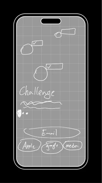
Paper prototypes caught navigation problems that would have cost days to fix in high fidelity.
04Key decisions
Three moves that mattered.
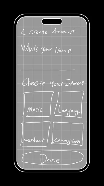
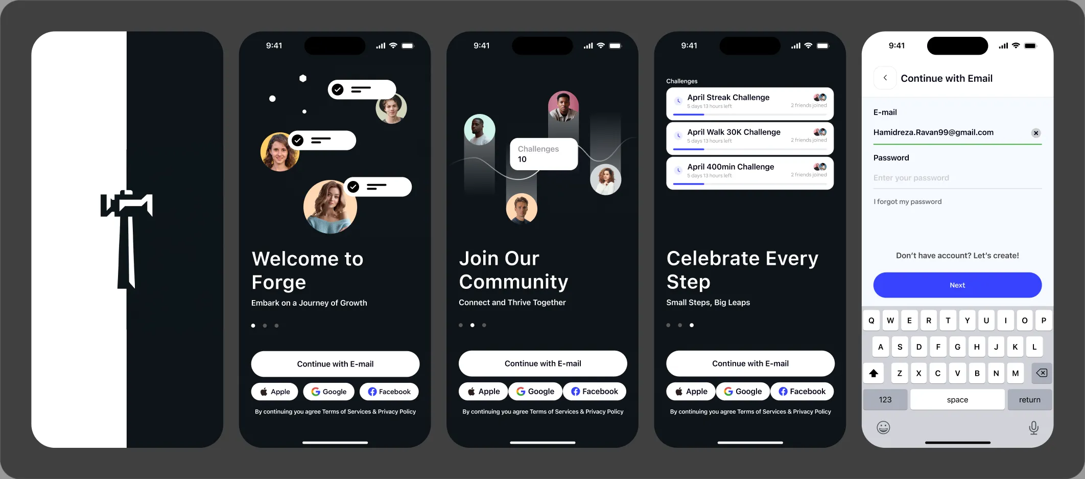
Interests chosen during onboarding
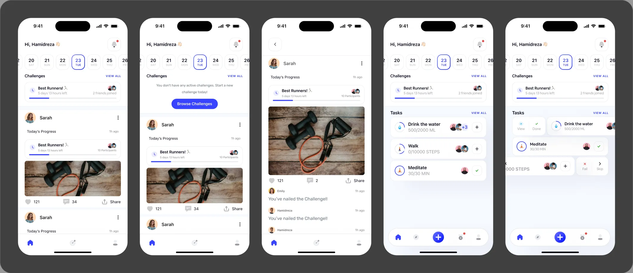
Research showed people wanted challenges that matched their goals, so onboarding asks what they care about. Every test participant completed onboarding.
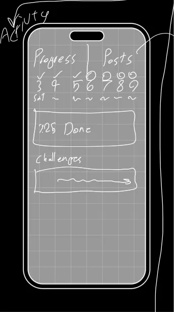
A calendar at the top of home
People needed to see progress at a glance. Participants singled out the calendar as the most intuitive part of the screen.
Community as a main tab, not a menu item
Social support was rated extremely important, so the community feed sits one tap from home. All participants found and used it.
05Outcome
Five participants, five tasks, every one completed.
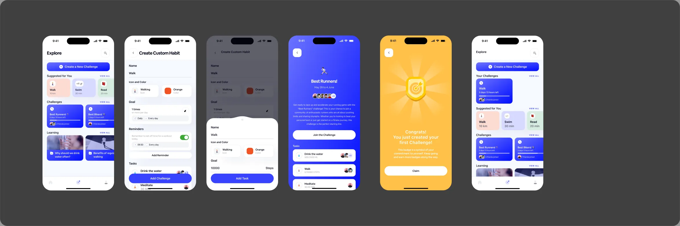
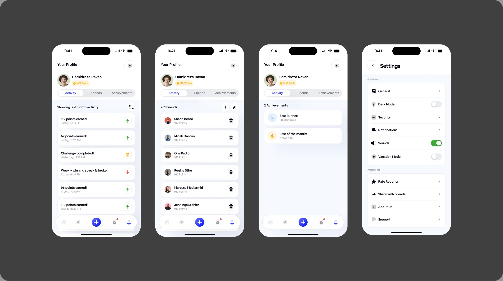
I ran moderated usability tests with five people who matched the personas, using think-aloud. They created an account, joined a challenge, created a challenge, read a comment thread and found a friend list. Everyone completed every task.
“Navigation was clear. I can find whatever I want so quickly.” Participant 3
The surprise was the badges. Participants brought them up unprompted as a motivator, because they celebrated personal progress rather than competition. People didn’t want to beat others. They wanted to beat yesterday’s version of themselves.
This was a usability test, so it shows the flows work. It can’t show the app would raise daily use or retention. That would need a larger study, A/B tests on the gamification and a 30-day cohort.
06Reflection
What I learned.
Writing hypotheses before building stopped feature creep: every decision had a reason. The strongest insight wasn’t about buttons or flows. It was that people improve together better than alone, and that shaped every screen.