Confidential · in-house product · 2022
Crypto Cover
An app that lets crypto holders insure their coins against a price drop, from choosing cover to a signed contract.
5
screens from amount to signed contract
2
surfaces: mobile app and landing page
1
cost in one unit, in the 2026 revisit
00 / Summary
- Role
- Product designer
- When
- 2022
- Platform
- Mobile app and landing page
- Method
- Flows, visual design
- Colour
- #0B3B33
- Problem
- Holders wanted protection from a crash without selling, but insurance terms are hard to grasp and crypto makes them harder.
- What I did
- Designed the full journey (onboarding, a cover calculator, plan choice, contract and confirmation) plus a landing page, in a calm dark-and-mint visual language.
- Result
- It was built. I designed it; developers built it. A 2026 revisit turns the plan list into one plain-language quote.
01Problem
Keep your coins. Lose the fear.
When the market falls, a crypto holder has two bad options: sell and miss the recovery, or hold and watch the loss grow. This product offered a third: insure the coins against a drop. If the price fell below an agreed level before the cover ended, the loss would be paid.
The idea is simple. Insurance is not. Words like cover price, premium and term confuse people even in ordinary finance, and here they sit on top of a volatile asset.
02The journey
Five screens, one decision each.
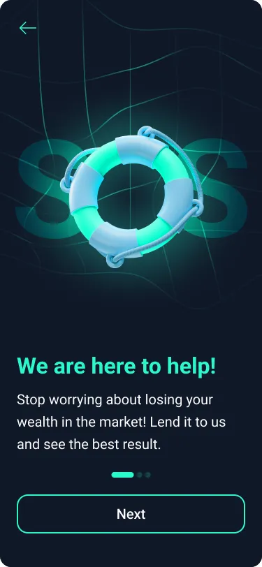
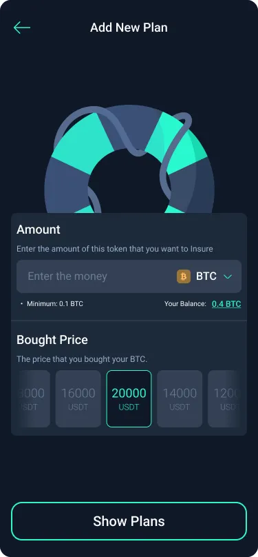
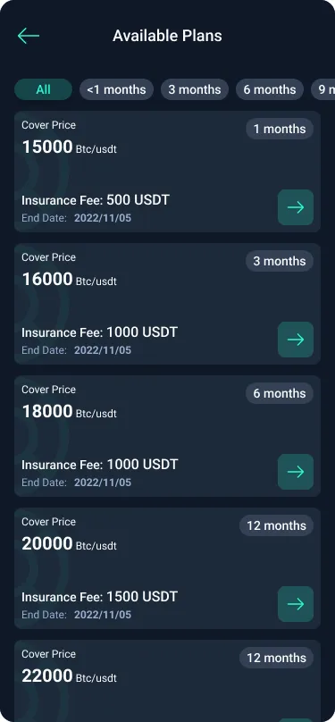
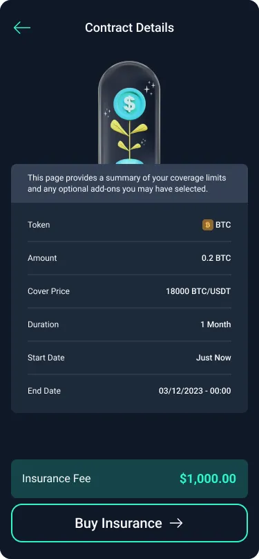
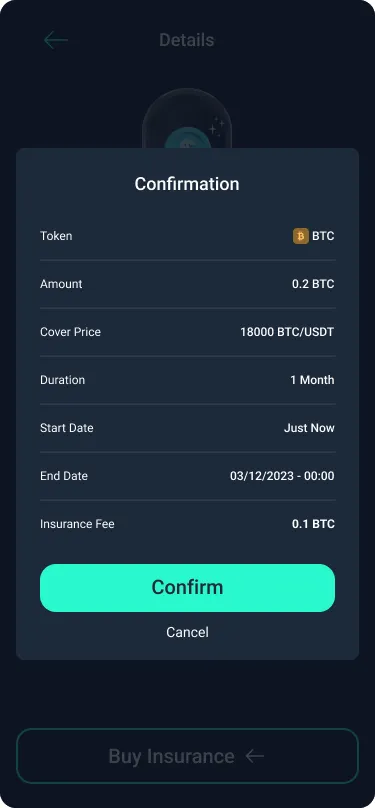
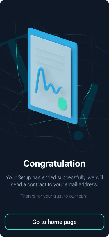
I broke buying cover into steps that ask one thing at a time. How much BTC to protect, and what you paid for it. Which plan, by cover price and length. The contract in plain rows. A last confirmation. Then a clear finish, with the contract sent by email.
03After you buy
Show cover working, not just bought.
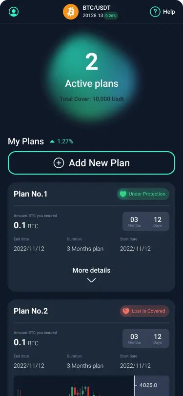
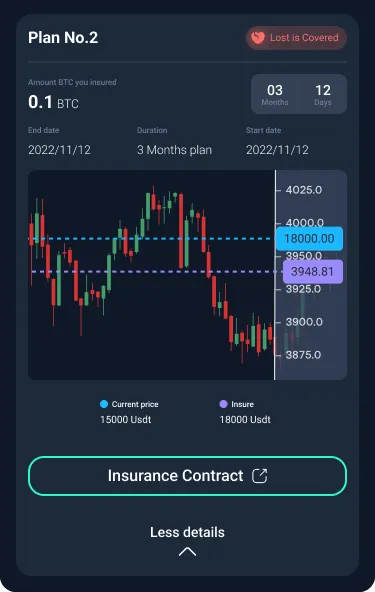
Home leads with what matters to a worried holder: how many plans are active and how much is covered. Each plan shows its state in a word, “Under protection” or “Lost is covered”, and opens to a chart that puts the current price against the insured price, so the cover is visible exactly when the market turns.
04Landing page
A calm voice for an anxious moment.
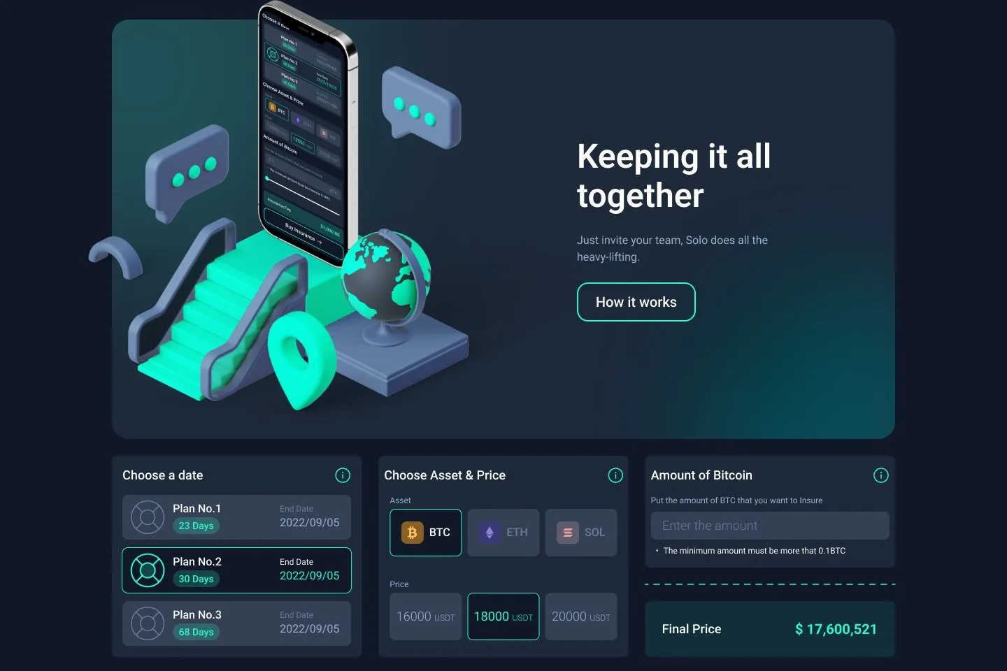
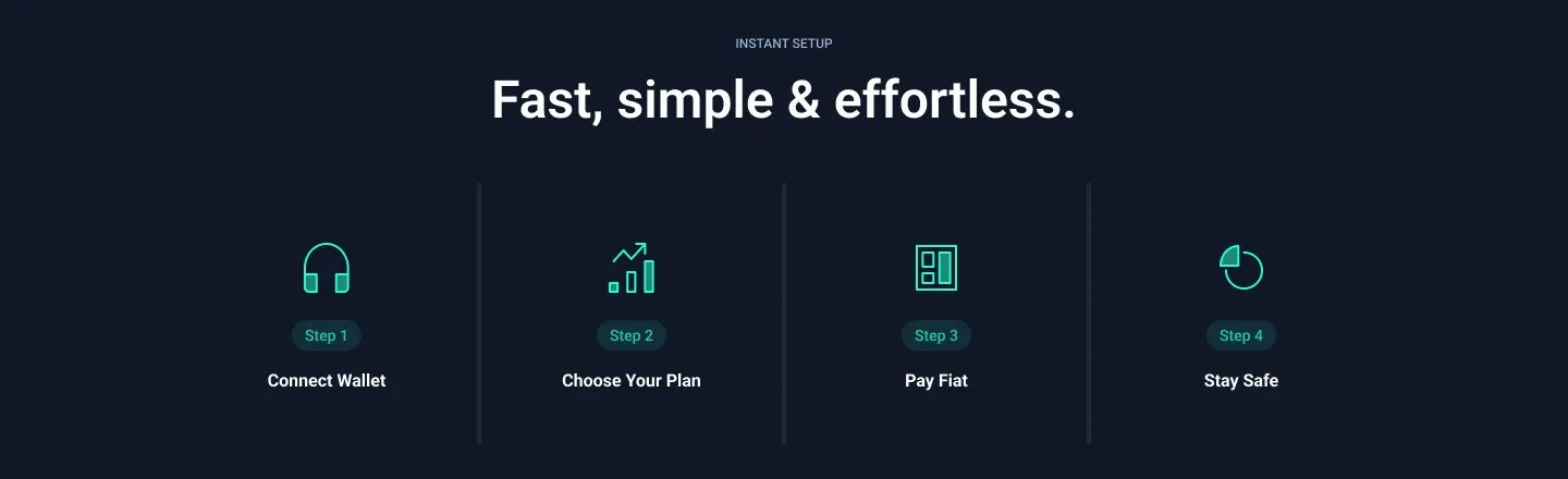
The visual language is deliberately quiet: deep navy, one mint accent and soft 3D objects such as a life ring, a sealed contract and a growing coin. On the landing page, a calculator lets visitors try a plan before signing up, followed by four steps from connecting a wallet to staying safe.
05Outcome
From a scary idea to a short flow.
It was built. I designed the app and the landing page; the development team built them. The company stays unnamed, and I don’t have usage numbers to share.
06Revisited, 2026
One quote, in plain words.
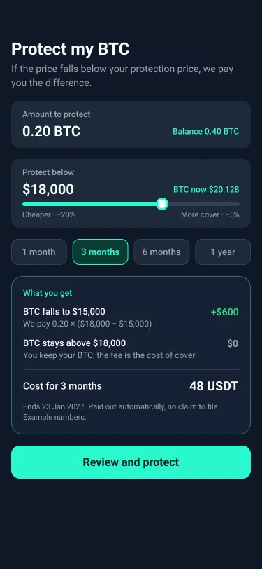
Looking back, the flow asks people to understand insurance before it explains it. They pick a “cover price” from a list without seeing what it would pay. The fee appears as USDT on the plan list, as dollars on the contract and as BTC on the confirmation. I redesigned the start of the journey in 2026. It’s a revisit, not what was built.
- One screen instead of three: amount, protection price and length, with the quote updating live.
- The protection price as a slider against today’s price, trading cost against cover.
- “What you get” shown as outcomes: what’s paid if BTC falls to a given price, and what happens if it doesn’t.
- One cost, in one unit, for the whole term.
07Reflection
What I took from it.
People don’t buy insurance terms. They buy an outcome: “if this happens, I get that back”. The closer a screen gets to saying exactly that, the less the rest of the flow has to explain.